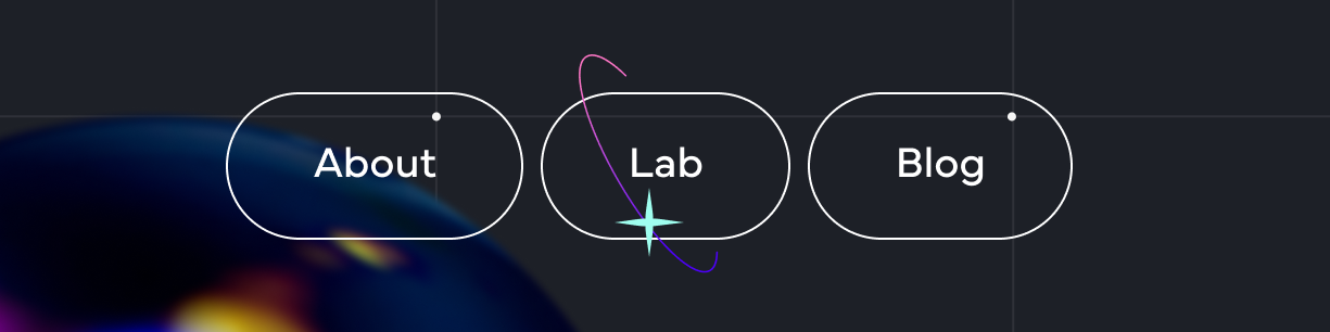
The ID Studio Website has recently had some design updates. I’m going to walk through the process of developing the new “Lab” button in our footer menu, and the techniques and tricks used for it.
The new button design in Figma
Rotating Rings
The button is enclosed by a ring spinning in 3D. To draw this I opted to use the 2D Canvas API. Any circle in 3D space can be represented (in orthographic projection) by a rotated ellipse. In this case the circle starts facing the viewer straight on, and rotates around the Y and Z axis (the vertical axis of the screen, and depth axis respectively). This makes the first bit of math simple. A circle of a given radius and Y/Z angles can be represented by a 2D ellipse, drawn to the canvas with:
ctx.ellipse(
    // X coordinate of center of circle
    <x coordinate>,
    // Y coordinate of center of circle
    <y coordinate>,
    // Ellipse X axis radius = circle radius multiplied by cosine of y angle
    // Math.abs() used to ensure radius is never negative
    <radius> * Math.abs(Math.cos(<y angle>)),
    // Ellipse Y axis radius = circle radius
    <radius>,
    // Ellipse rotation = angle of circle around Z axis
    <z angle>,
    0, // Start drawing ellipse at 0 radians
    2 * Math.PI // End drawing ellipse at 2π radians
);
Using time to drive the rotation around both axes then makes the ring constantly spin:
This is of course in orthographic projection as mentioned - so there’s no distortion of the ring as it rotates which you’d expect from perspective projection. However at the scale it will be visible on screen, it’s close enough to perspective projection for our use.
Now that the start of the animation is there, it needs to display around the button. The <canvas> element is scaled to be slightly larger than the button element, and centered:
The Tricky Math Bit
At this point however, there's an issue: The circle is meant to be rotating in 3D. Half of the circle should show in front of the button, the other half behind the button. The <canvas> element is a single layer with no depth, and can only display either fully below, or fully above, the button.
The design indicates this depth by cutting the circle off just before the point at which it begins to overlap the button. In theory this makes it simpler: The ellipse can always be drawn above the button. The Canvas API allows controlling how much of the ellipse is drawn, by setting a start and end angle to draw between. The position of the cut off is known (just a few pixels above the button) and it's trivial to find the angle to a point on a circle at a given height. Surely there's only a few extra simple steps to account for the rotation, and scaling of the ellipse, I thought.
In practice, this was not that simple.
After attempting a few different methods to determine the angles as if the ellipse were merely a scaled and rotated circle, I decided I was going in the wrong direction. Staring at the Wikipedia entry for ellipses in Cartesian coordinates was also not bearing much fruit. After consulting my brother, a mathematician, along with Wolfram Alpha, I finally ended up with a working process to determine the X coordinate of the intersection of the ellipse with the line at the height of the cut-off region around the button;
/*
a = <radius Y>
b = <radius X>
angle = <angle Z>

A = (a ^ 2) * (sin(angle) ^ 2) + (b ^ 2) * (cos(angle) ^ 2)
B = 2 * ((b ^ 2) - (a ^ 2)) * sin(angle) * cos(angle)
C = (a ^ 2) * (cos(angle) ^ 2) + (b ^ 2) * (sin(angle) ^ 2)
D = -2 * A * x0 - B * y0
E = -B * x0 - 2 * C * y0
F = A * (x0 ^ 2) + B * x0 * y0 + C * (y0 ^ 2) - (a ^ 2) * (b ^ 2)

- As the ellipse center (x0, y0) is 0, 0
D = 0
E = 0
F = - (a ^ 2) * (b ^ 2)

- An arbitrary point on the ellipse;
A * (x ^ 2) + B * x * y + C * (y ^ 2) + D * x + E * y + F = 0

- Using D and E = 0
A * (x ^ 2) + B * x * y + C * (y ^ 2) + F = 0
A * (x ^ 2) + y * (B * x + C * y) + F = 0

- To solve for x
x = ( - B * y [+/-] sqrt( (B ^ 2) * (y ^ 2) - 4 * A * (C * (y ^ 2) + F ) ) ) / (2 * A)
*/

const radiusX = <radius> * Math.abs(Math.cos(<angle Y>));
const radiusY = <radius>;
// The angle when drawing the ellipse with the Canvas API is ½π different
const theta = <angle z> + Math.PI * 0.5;
// The y coordinate where the cut off needs to happen
const y = <button height> * 0.5 + <gap>;

const A =
    radiusY ** 2 * Math.sin(theta) ** 2 +
    radiusX ** 2 * Math.cos(theta) ** 2;
const B =
    2 *
    (radiusX ** 2 - radiusY ** 2) *
    Math.sin(theta) *
    Math.cos(theta);
const C =
    radiusY ** 2 * Math.cos(theta) ** 2 +
    radiusX ** 2 * Math.sin(theta) ** 2;
const F = -(radiusY ** 2) * radiusX ** 2;

// Calculate the two X coordinates that intersect with the line at the given Y coordinate
const x1 =
    (-B * y +
        Math.sqrt(
            B ** 2 * y ** 2 - 4 * A * (C * y ** 2 + F)
        )) /
    (2 * A);
const x2 =
    ((-B * y -
        Math.sqrt(
            B ** 2 * y ** 2 - 4 * A * (C * y ** 2 + F)
        )) /
        (2 * A)) *
    -1;

// There is likely a way to calculate these 2 angles with less steps
const angle1 = Math.atan2(-y, x1);
const angle2 = Math.atan2(y, x2);

const cutoutAngle1 = Math.atan2(
    radiusX * Math.sin(angle1 + angleZ),
    radiusY * Math.cos(angle1 + angleZ)
);
const cutoutAngle2 = Math.atan2(
    radiusX * Math.sin(angle2 + angleZ),
    radiusY * Math.cos(angle2 + angleZ)
);
After that (more in depth than expected) process, we finally have the two angles that mark the beginning and end of the region of the ellipse that falls within the button's cut off area.
There's one more thing needed though. As the ring spins and reaches the end of a full rotation, there's a sudden jump as the cut-off region goes from one side of the ellipse to the other. I mitigate this by drawing the ellipse a second time, filling in only the cut-off region. This filled in area is faded in/out based on the angle of the ring:
Making it Pretty
Now the math for the spinning ring is all done, the other aspects of the design need to be applied. First is the colour, a pink-purple gradient:
Two techniques are used with this gradient when rendering the ellipse: First, an image of the gradient is rendered onto the canvas, using ctx.globalCompositeOperation = "source-in"; This masks the image to the ring, only showing above pixels where the ellipse has already been rendered.
At the same time, we modify the actual colour of the gradient, using ctx.filter = "hue-rotate(" + <time> + "deg)"; This changes the hue as time progresses, cycling slowly through purple ⟶ red ⟶ green ⟶ blue ⟶ purple.
The next step is a small star decoration that orbits the button - appearing and disappearing behind it. This is a small SVG image, also drawn to the canvas. The star is position is set by rotating a point around the Y, and then Z axis (like the ring before), and setting its opacity based on that Y angle:
The final design element is the interaction: When the button is hovered (mouse placed above it), the ring and star react. There's 2 changes that happen when hovering:
Additional rings, and another star, becomes visible.
The rings and stars move at a higher speed.
The code for drawing the ring is wrapped in a loop, showing it duplicated for a total of 4 rings. Each time it's drawn the Y and Z angles are offset, and the cut off regions recalculated. The star is likewise drawn twice, with an offset position.
The increased speed needs an extra step. Instead of keeping a single time variable, two variables are used. One to keep track of the actual time (so that the time between frames can be calculated), another which increases quicker when the hover is active, slower when not.
let timeAbsolute = 0;
let time = 0;

// Each frame...
const delta = <new timestamp> - timeAbsolute;
timeAbsolute = <new timestamp>;
time += delta * (1 + <hover> * 0.2);
This modified time value is then used to drive the rotation of the rings and stars. All combined we get the final button:


